Course Work; a valuable resource.
I was fascinated by the buildings by Gaudi, in particular the Casa Batlló in Barcelona. The outside of the building is wonderful but the staircase inside is a lovely exercise in the use of shading.
Robert Hughes says that 'Under the skylight where they take the most light, the skin of the internal walls is flat, a cobalt blue. The walls get lighter in colour and develop a ripple of texture (to catch the light falling from above) as they descend from floor to floor. They pass from cobalt to sky blue, and thence to pearly grey, before becoming white at street level for maximum reflection.'
Roberto Hughes Barcelona (1992) p 512. This is my picture of the internal stairwell.
https://www.casabatllo.es/en/virtual-tour/
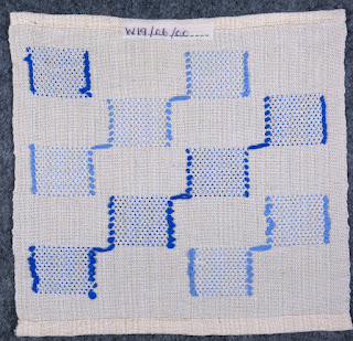
The remit from the HNC course was to design materials for a range of purposes. Here are some of my samples inspired by the stairwell tiles.
Weave structure: Monks belt - for a cushion cover.
This is an interesting structure with regular floats on a plain weave background.
 |
| Weave draft Monks Belt |
 |
| The woven sample |
Weave structure: Boulevard weave - for a cushion cover
 |
| Weave draft for Boulevard weave. |
 |
| Boulevard weave |
Weave structure: Inlay
 |
| Inlay |
 |
| reverse of inlay sample |
Some of the entries in my sketch book.


No comments:
Post a Comment
All comments are moderated before being posted. There will be a slight delay before your message appears.